Improvements
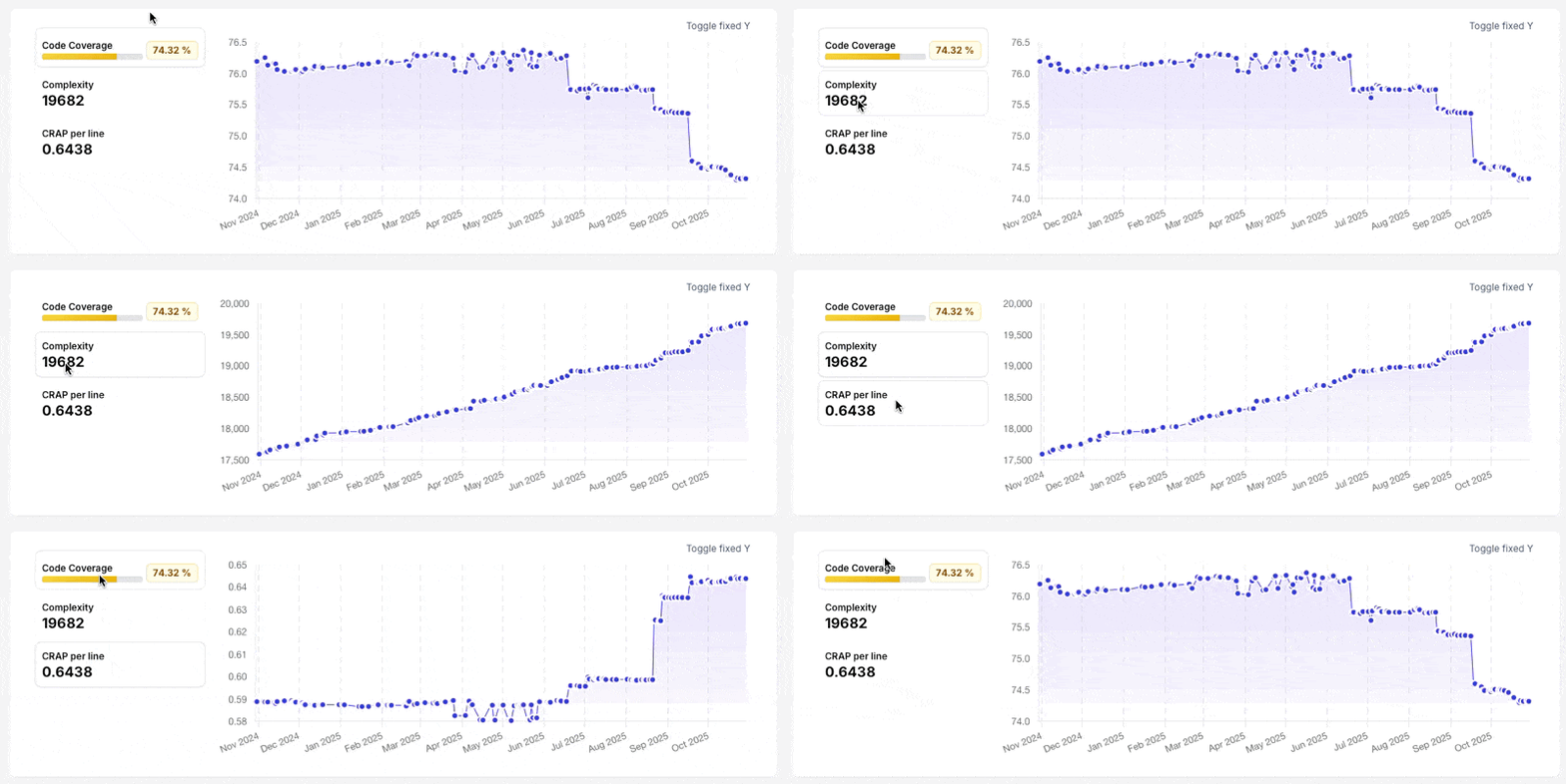
Today we are adding graphs for CRAP per line and Complexity when viewing the repository, for all plans. Simply click the metrics when available and it will show you a history of coverage, complexity or 'CRAP per line' respectively.
Each metric shows the difference introduced, such as increased coverage, decreased complexity and so on.
As with coverage, the complexity and 'CRAP per line' also links to the related commit / Pull Request and will take you there simply by clicking on the point in the graph when hovered.
This will give your team a much better understanding of what is going on with your projects code quality.
We are also working on adding historical type coverage reporting into this graph, as well as other reporting features being added to all plans.
Bugfixes
Fixed: Ingress pipelines has been improved to better handle spikes and invalid data
We regularly update our changelog in an effort to improve transparency into the development process. If you have any questions or feedback, please don't hesitate to contact us.
If you are a user of OtterWise already, or have been reading our blog, you might already know that we take privacy extremely serious, even when it comes to protecting your code as if it was sensitive personal information, this goes for everything we do, which is why we publish changelogs for even smaller updates, rather than just major releases.
Our weekly digest for OtterWise users also includes our changelog in the bottom (see related changelog), to keep you up-to-date with the latest changes.